Logo Redesign
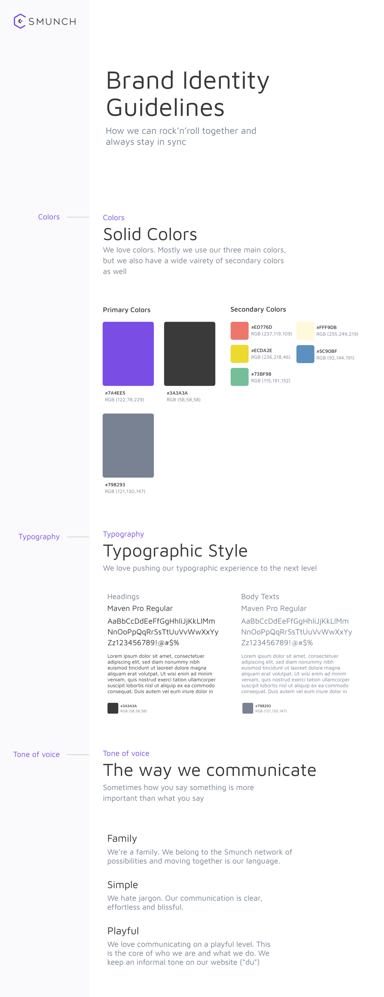
Design System
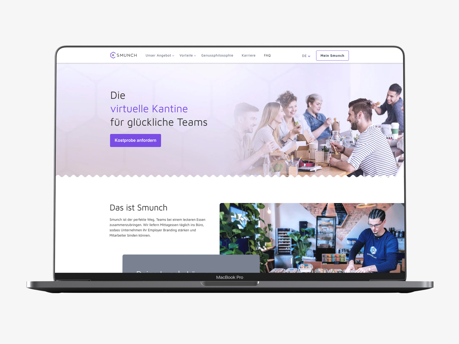
Website - Desktop
Homepage
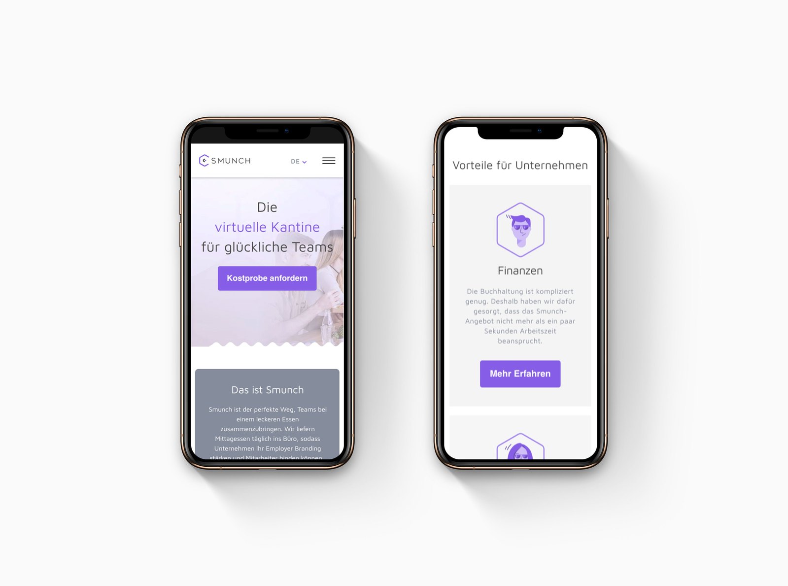
Website - Mobile
Mobile view - homepage
Desktop App
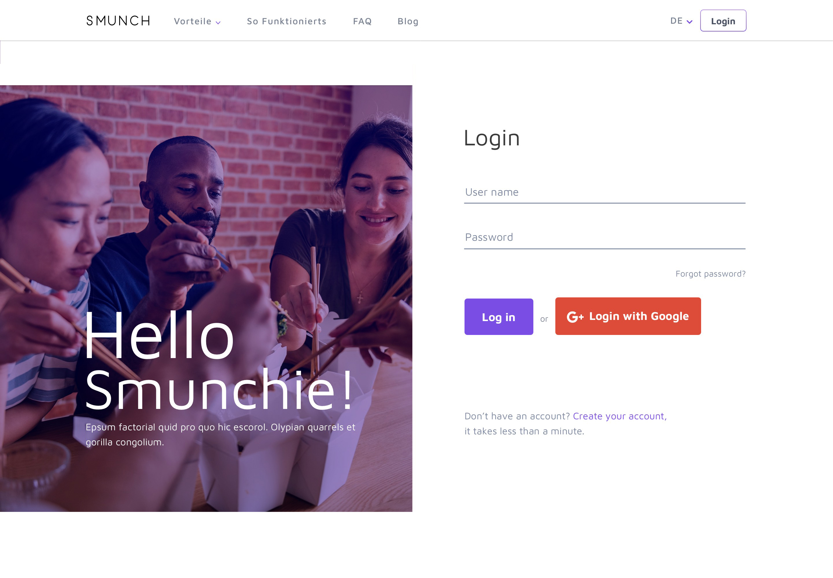
Login
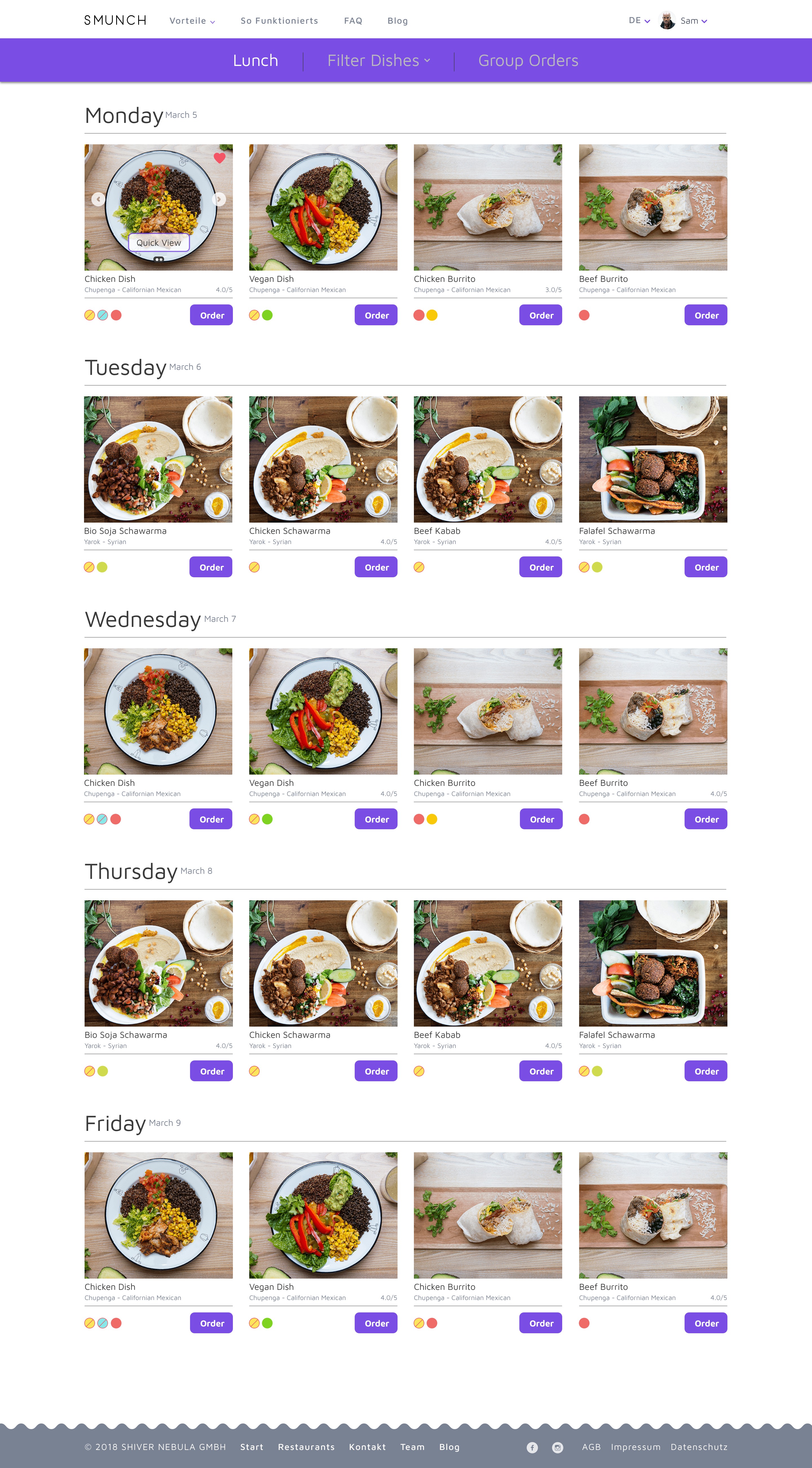
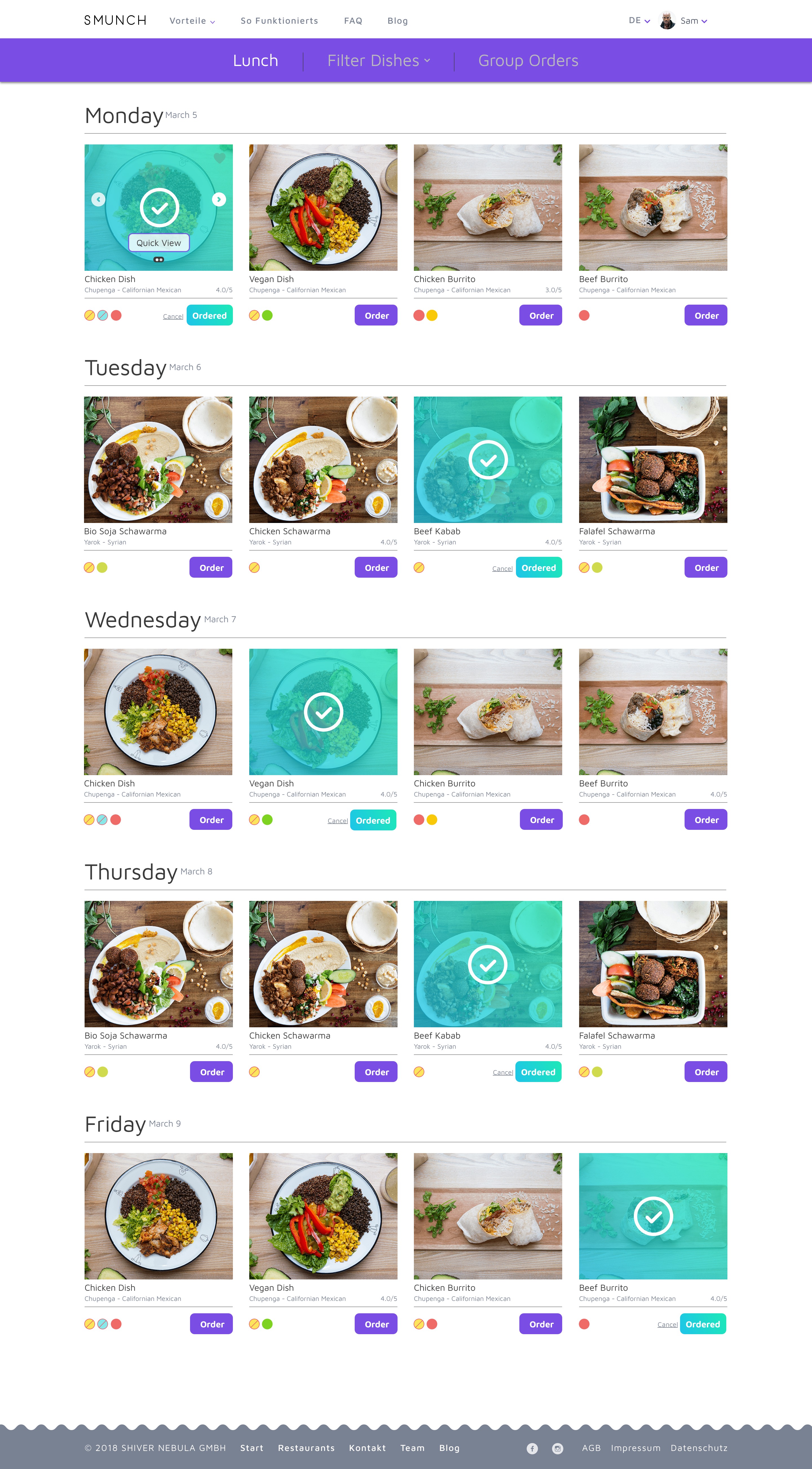
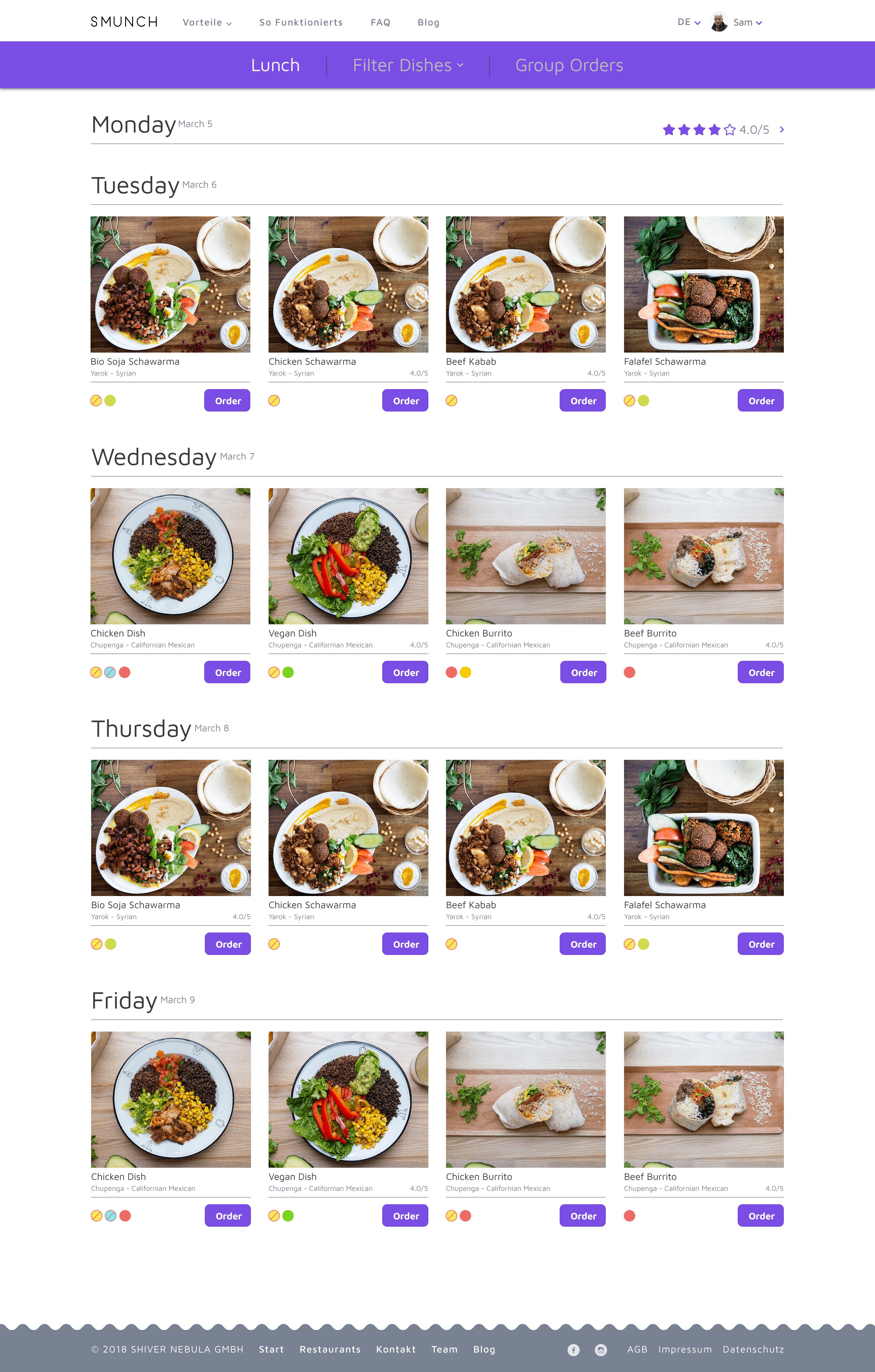
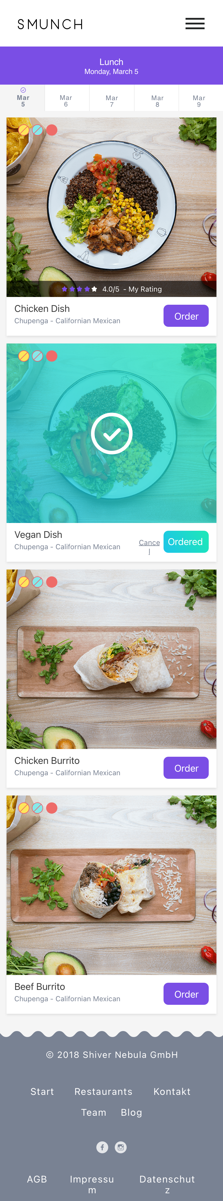
Lunch Orders
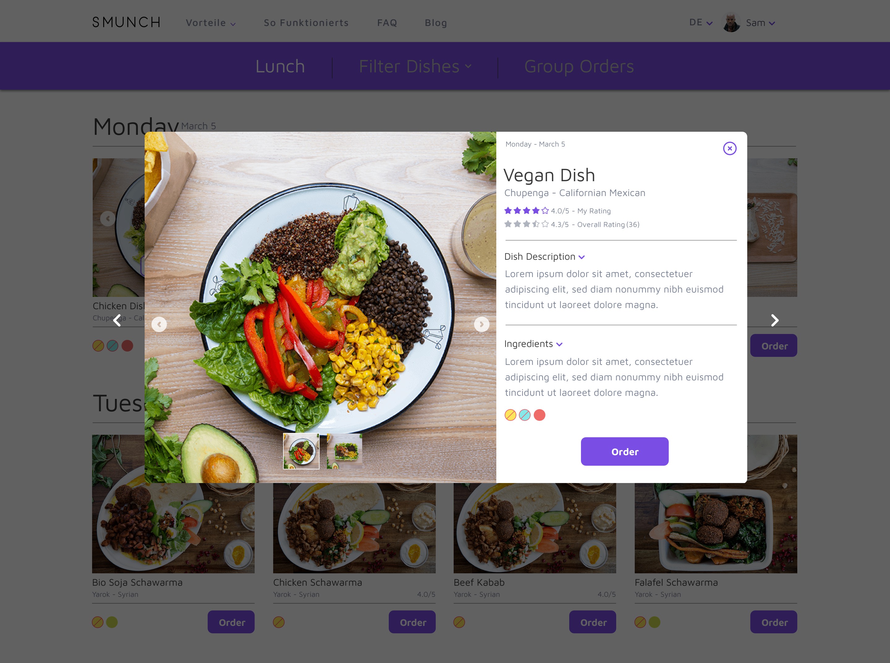
Quick View
Dish Select
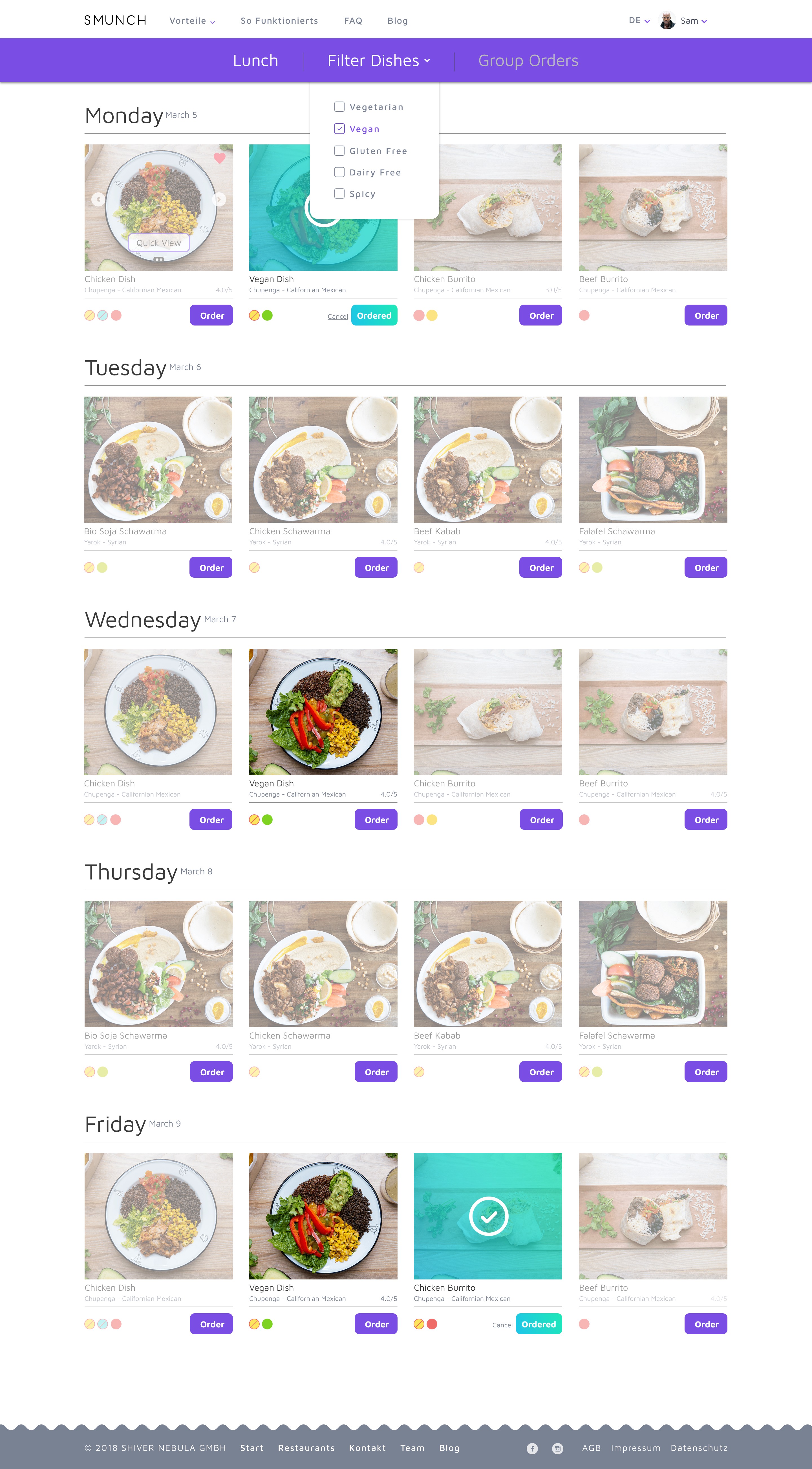
Filter Dishes
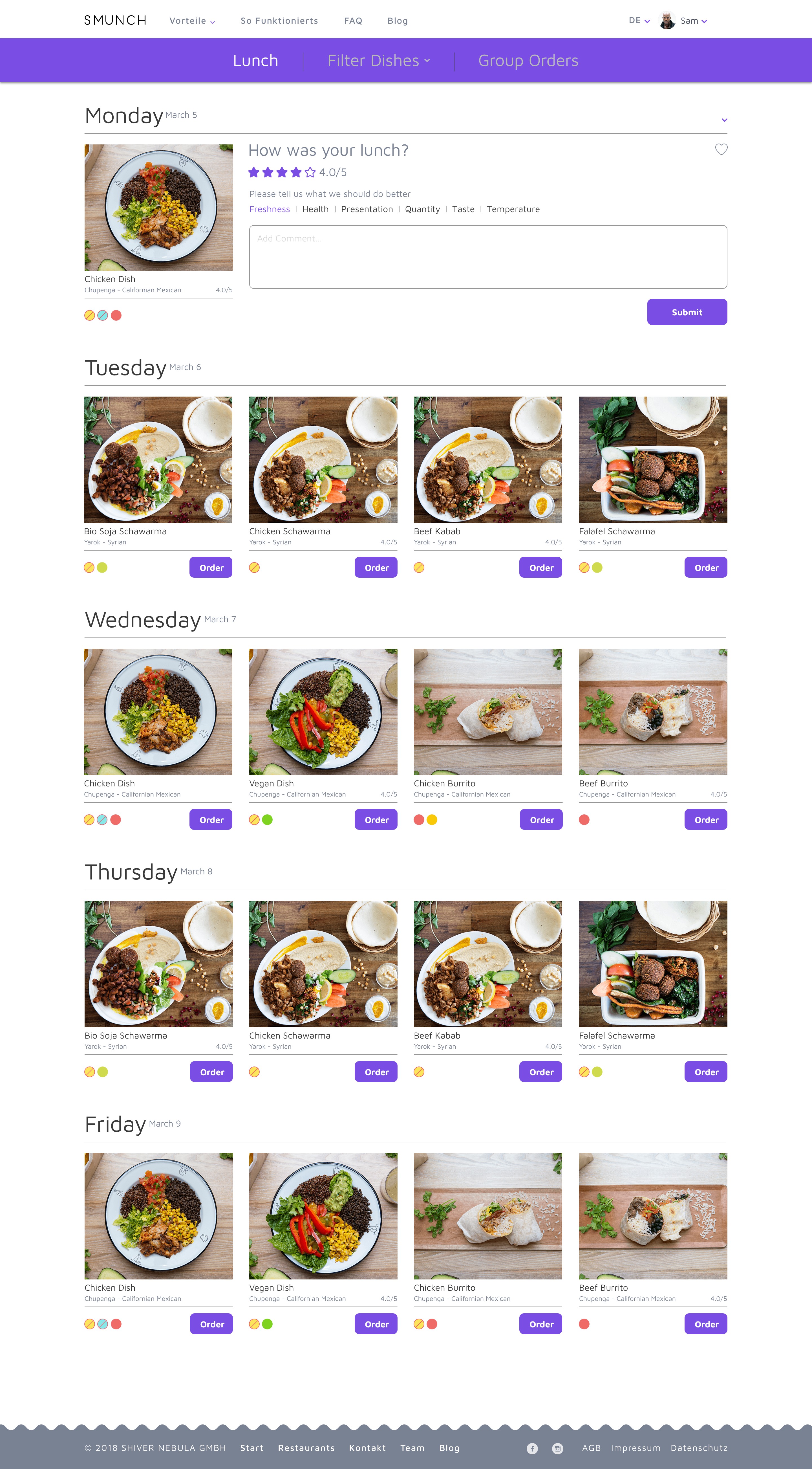
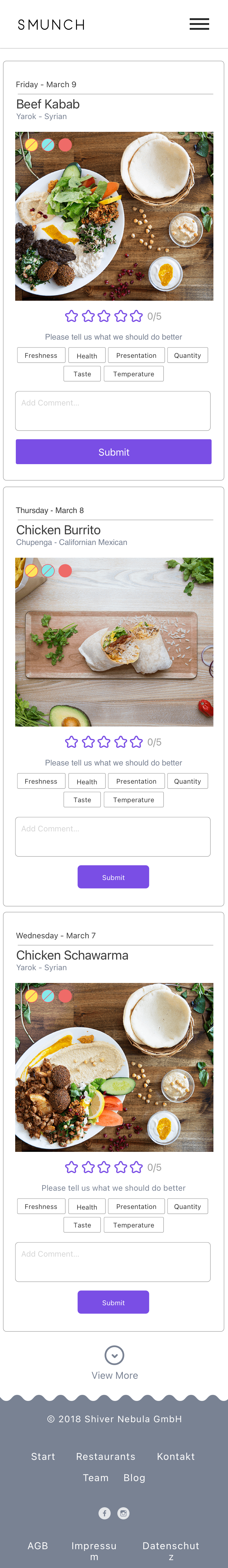
Review
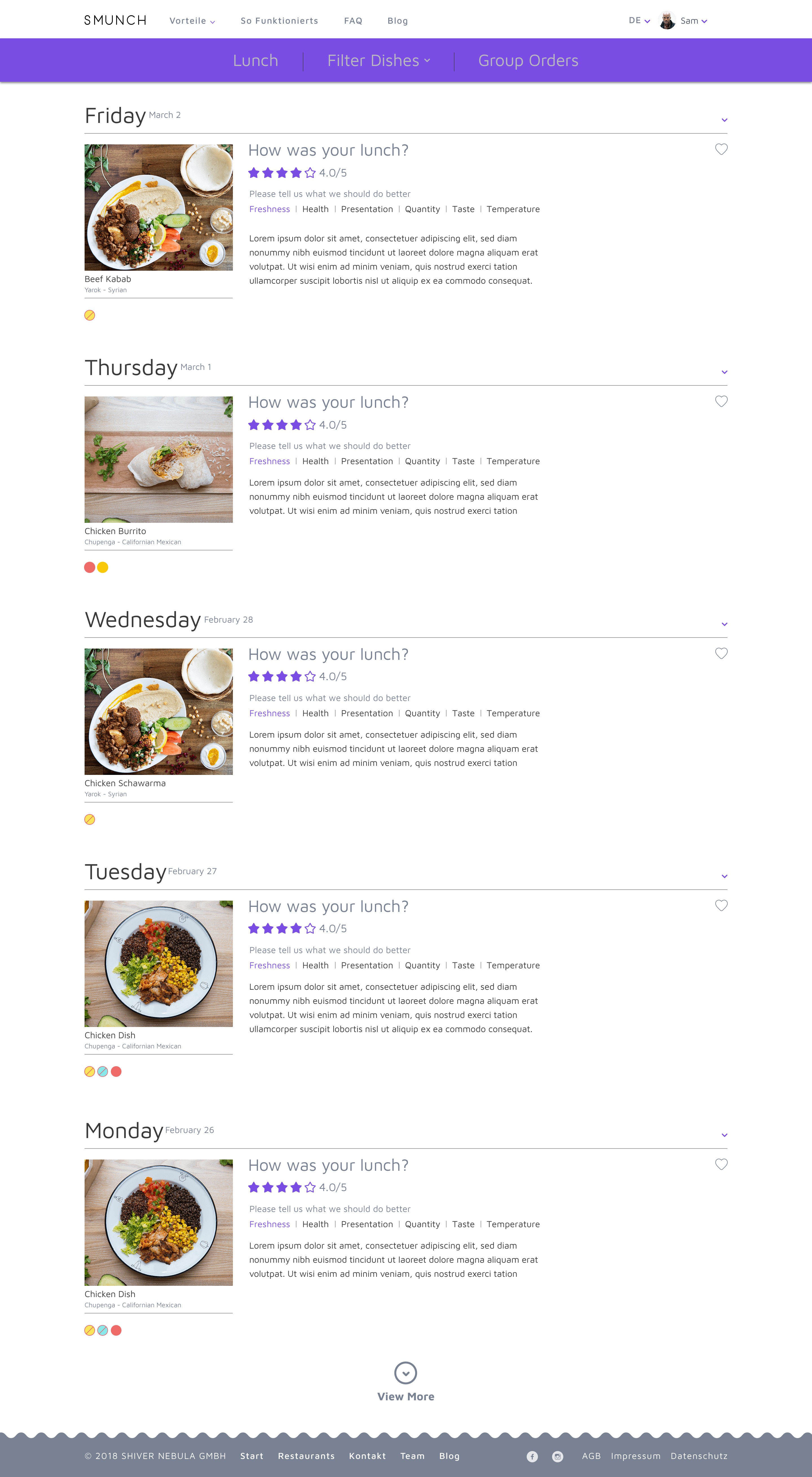
Rated Meals
Review - Accordion
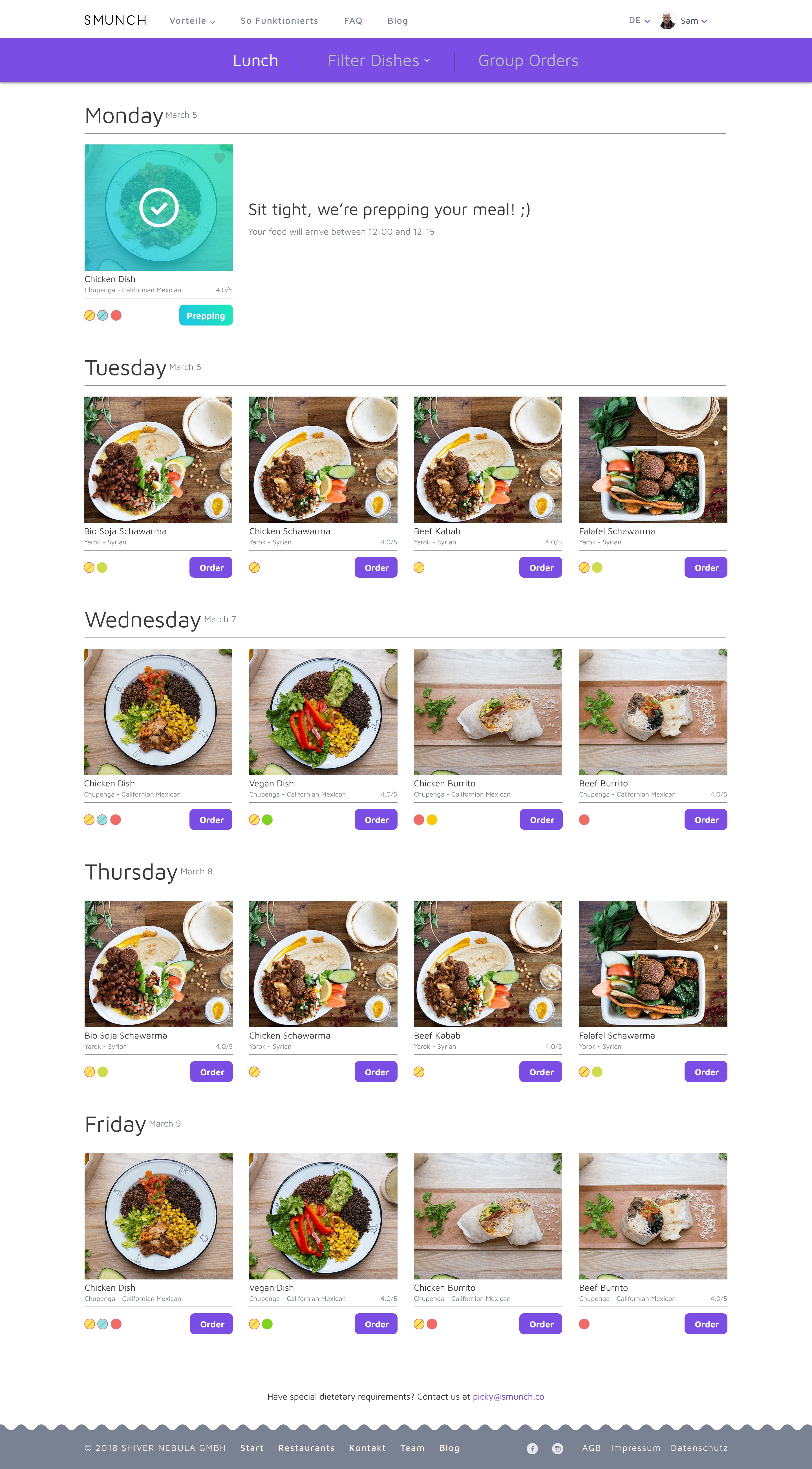
Prepping
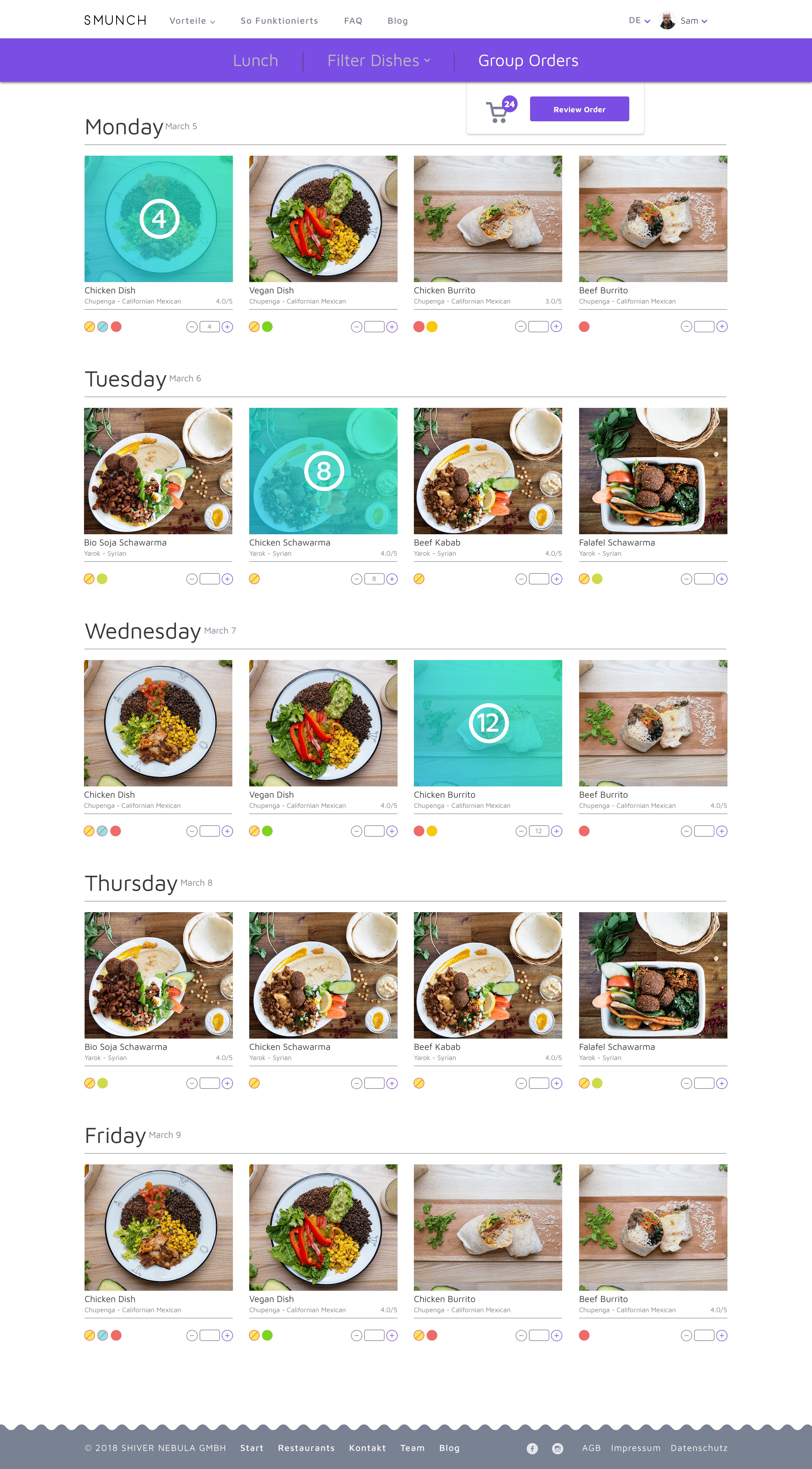
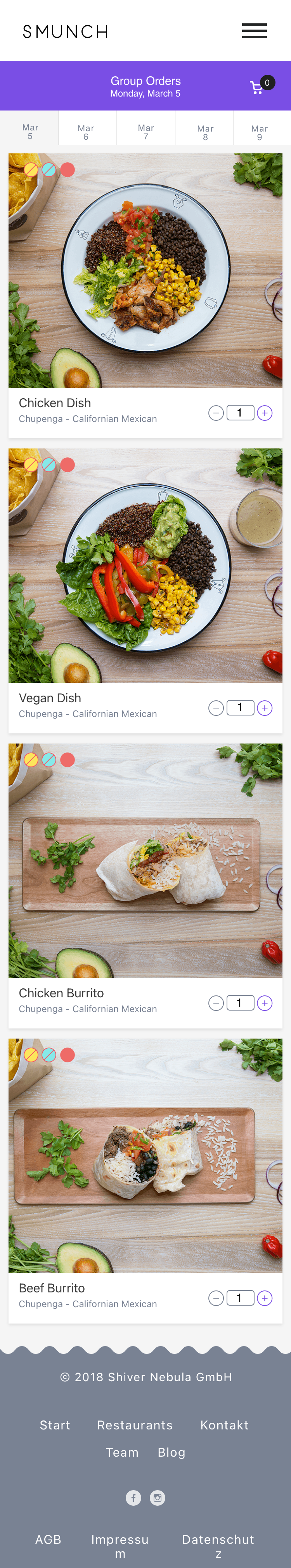
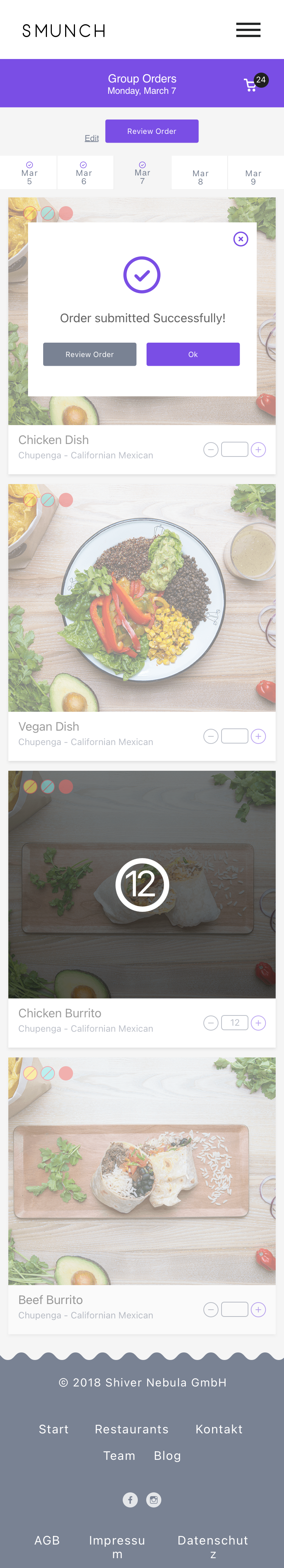
Group Orders
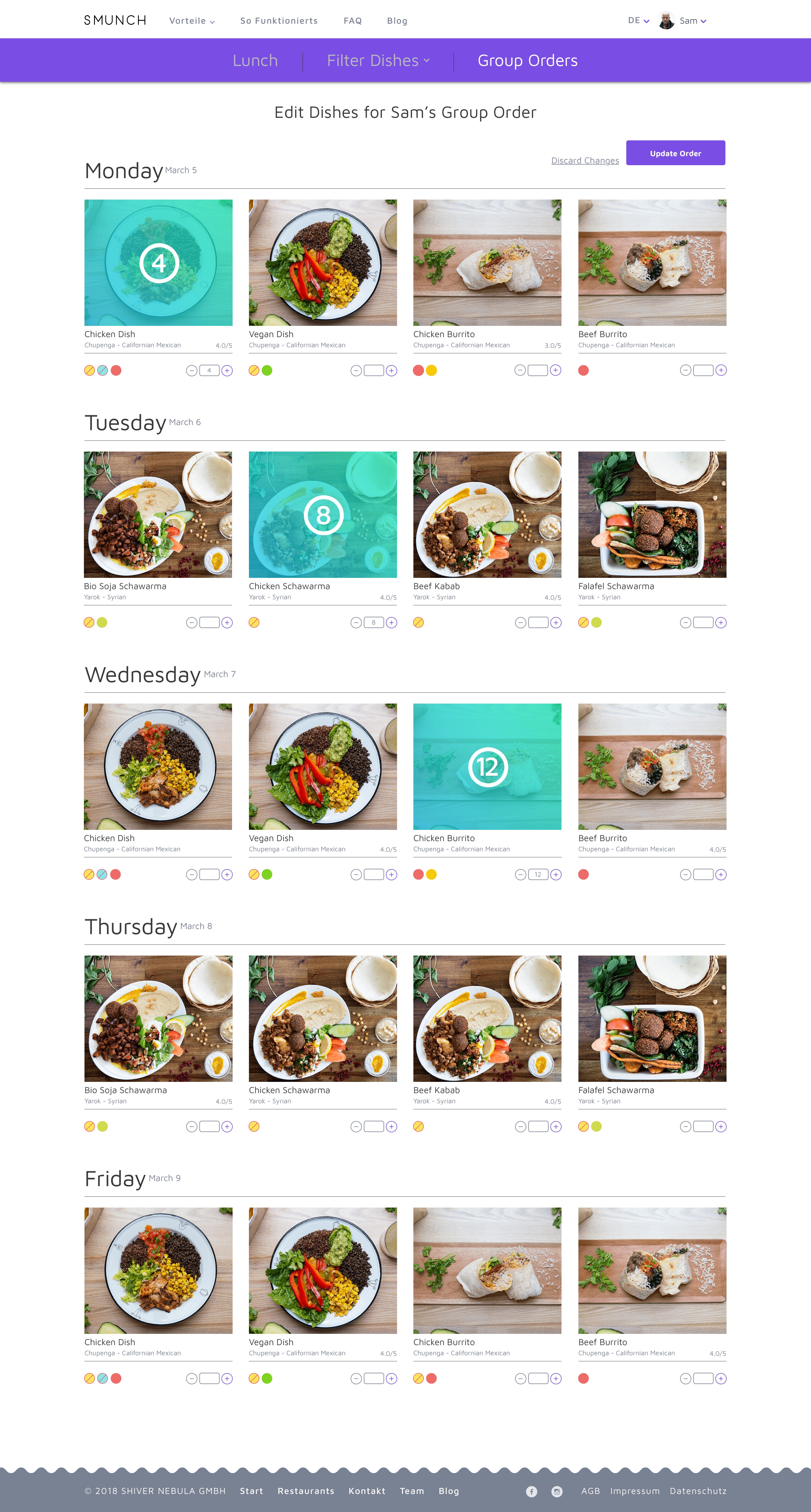
Edit Dishes
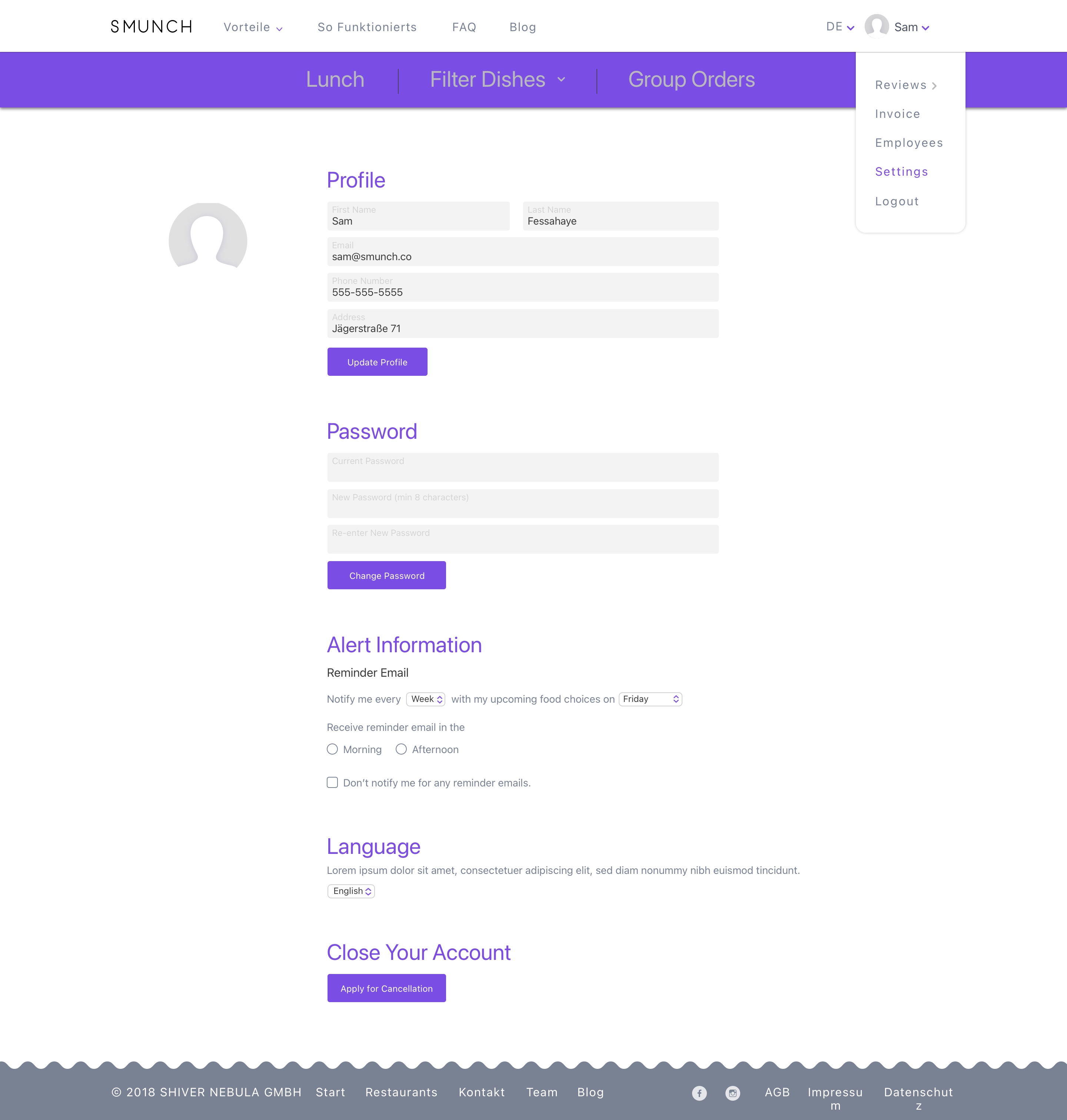
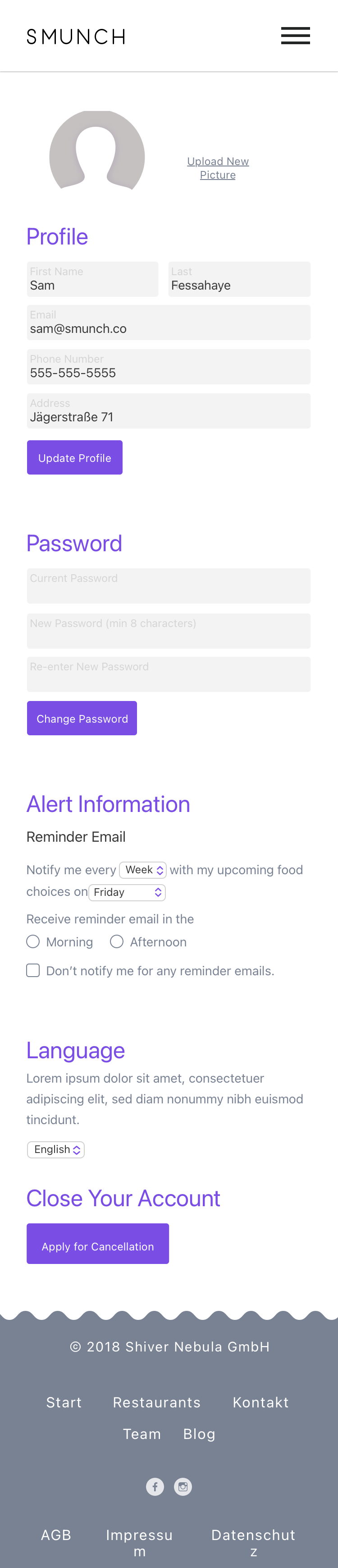
Settings
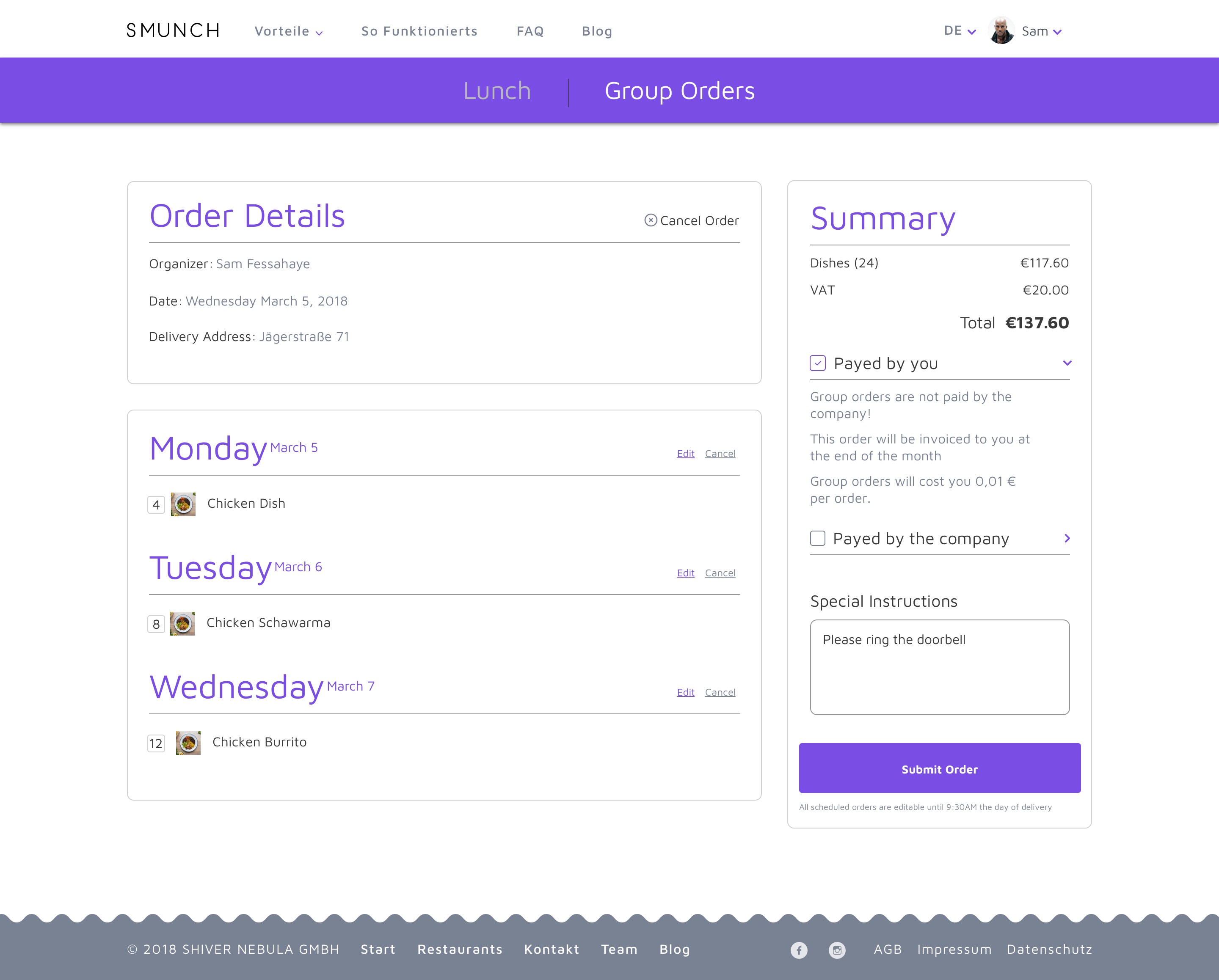
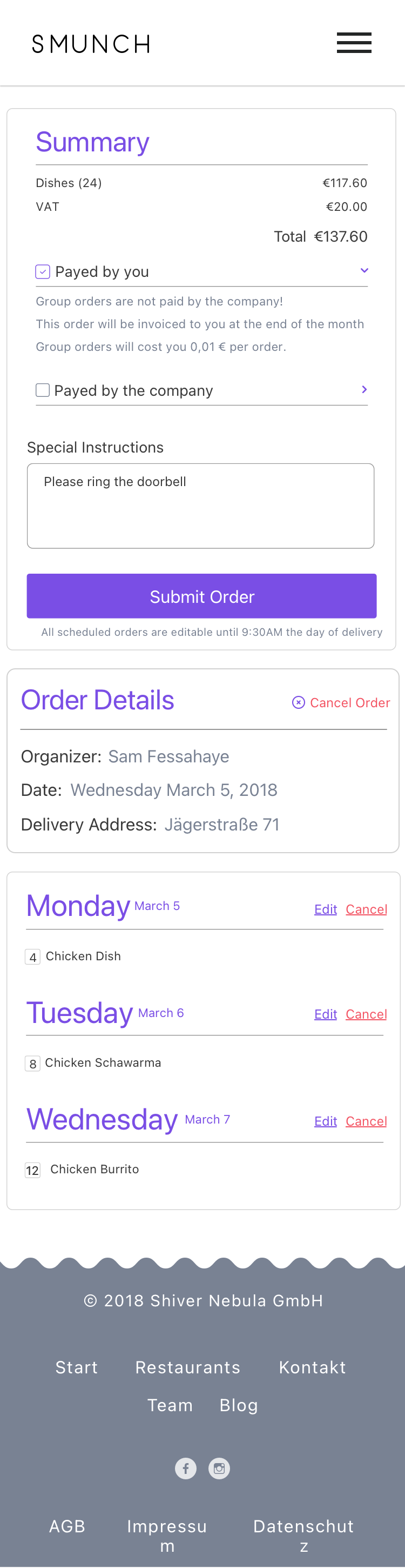
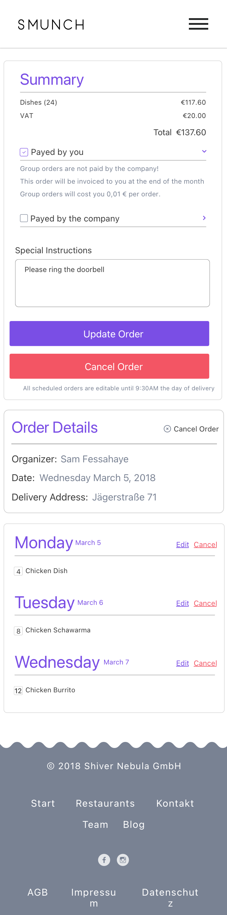
Review Order
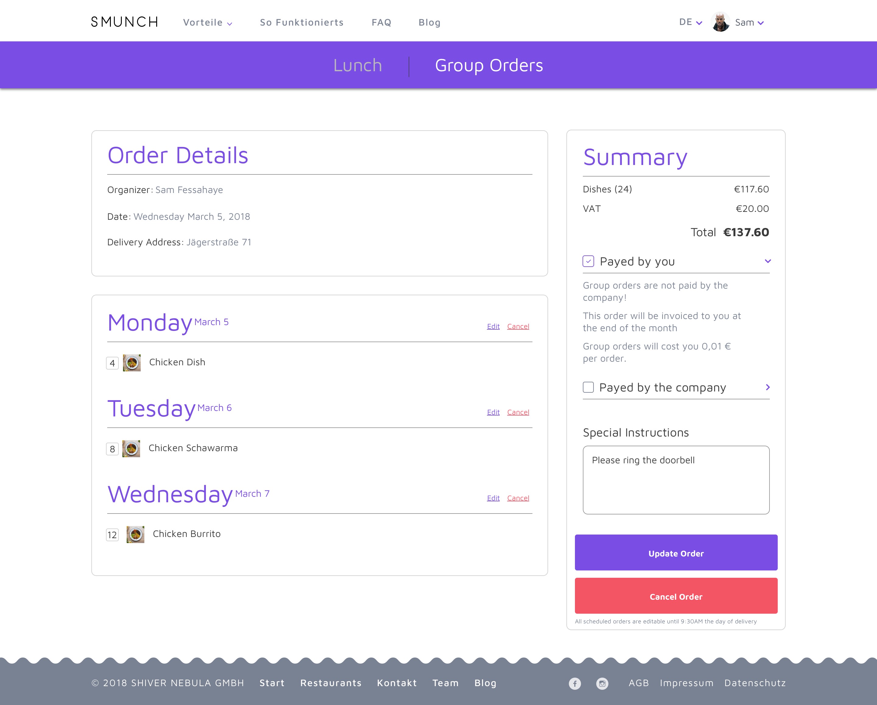
Update Order
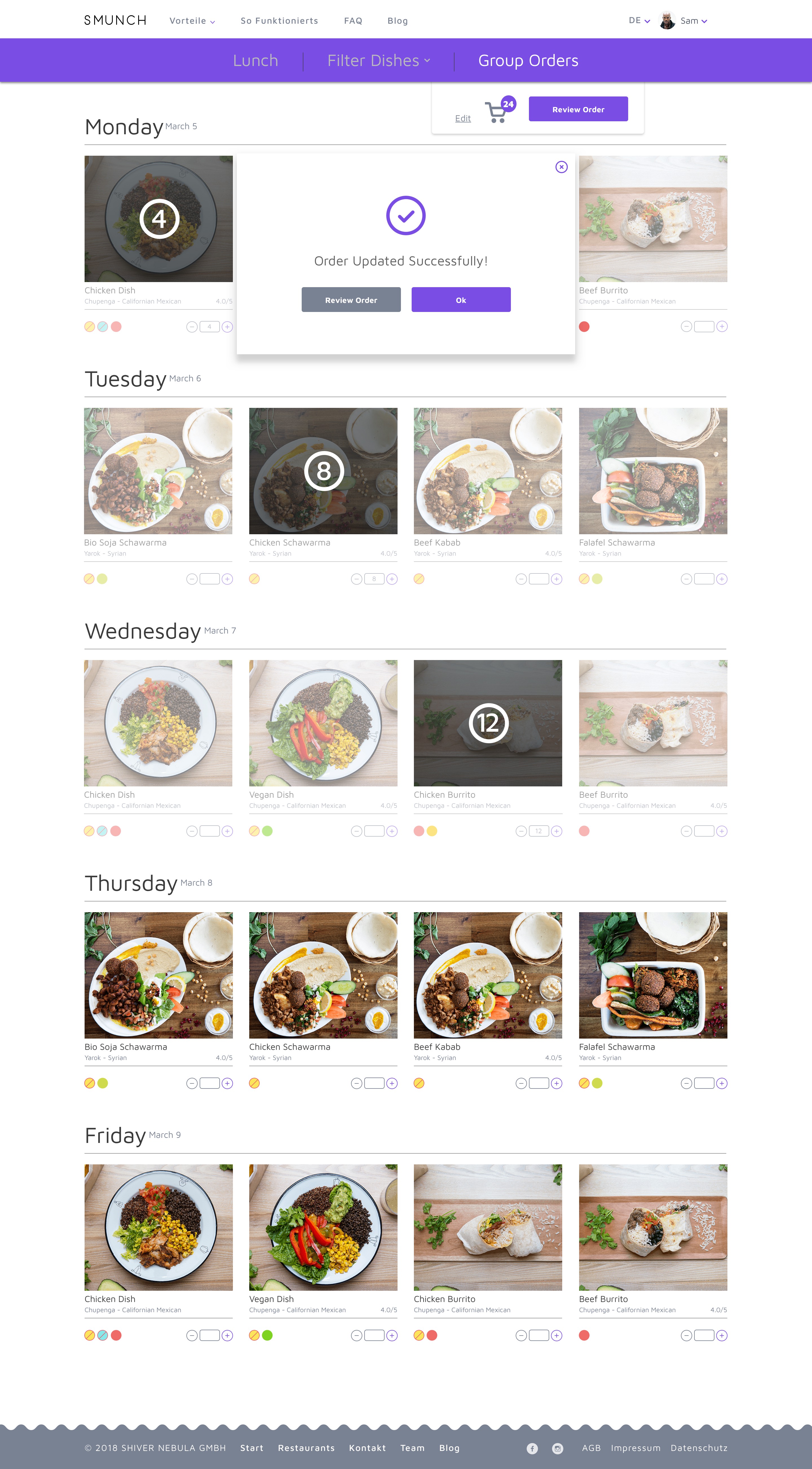
Order Success
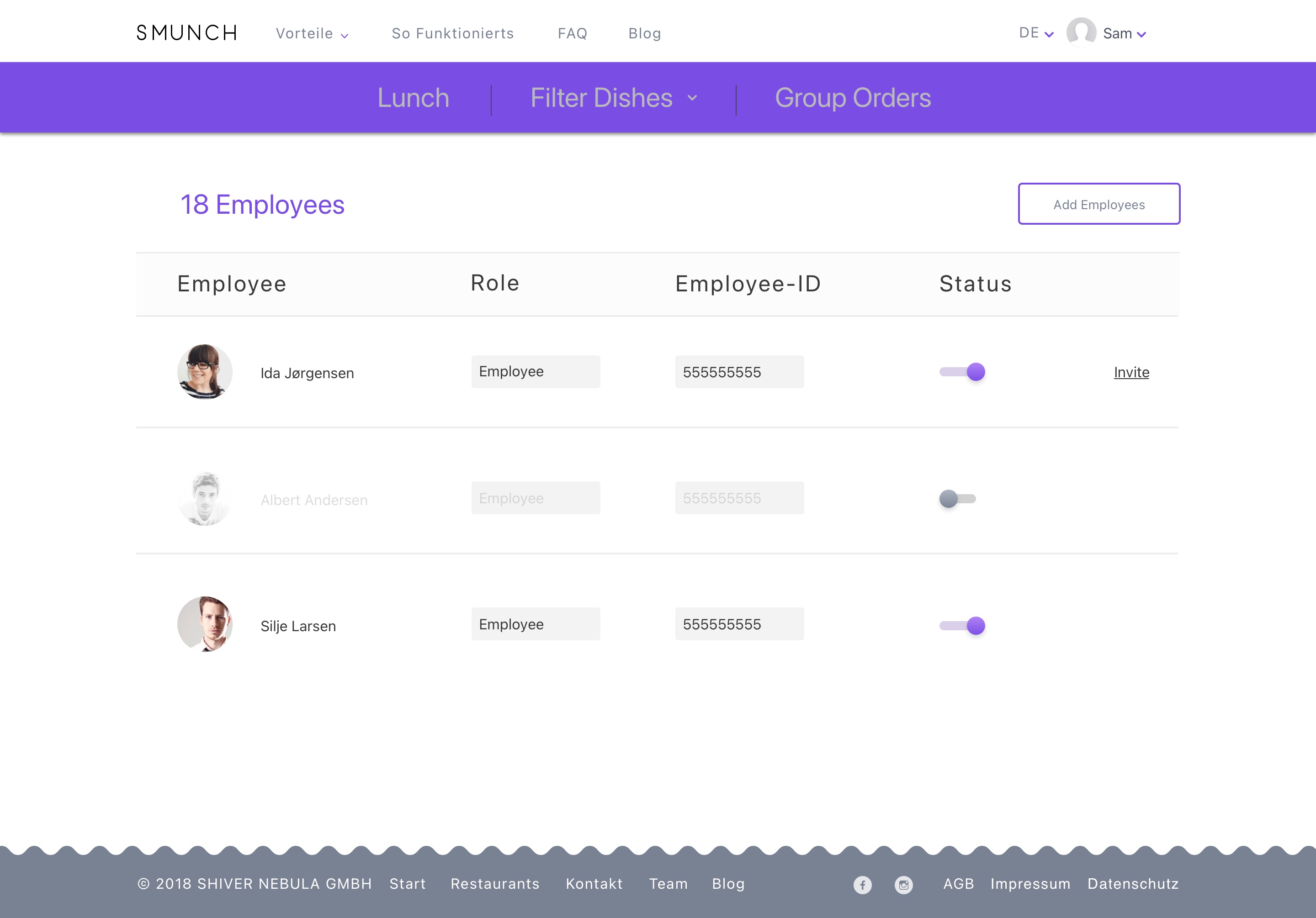
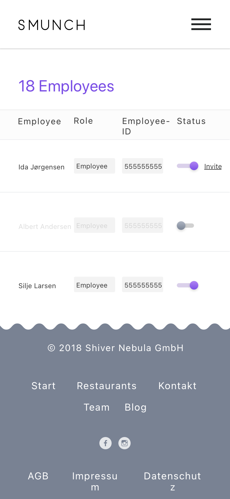
Employees
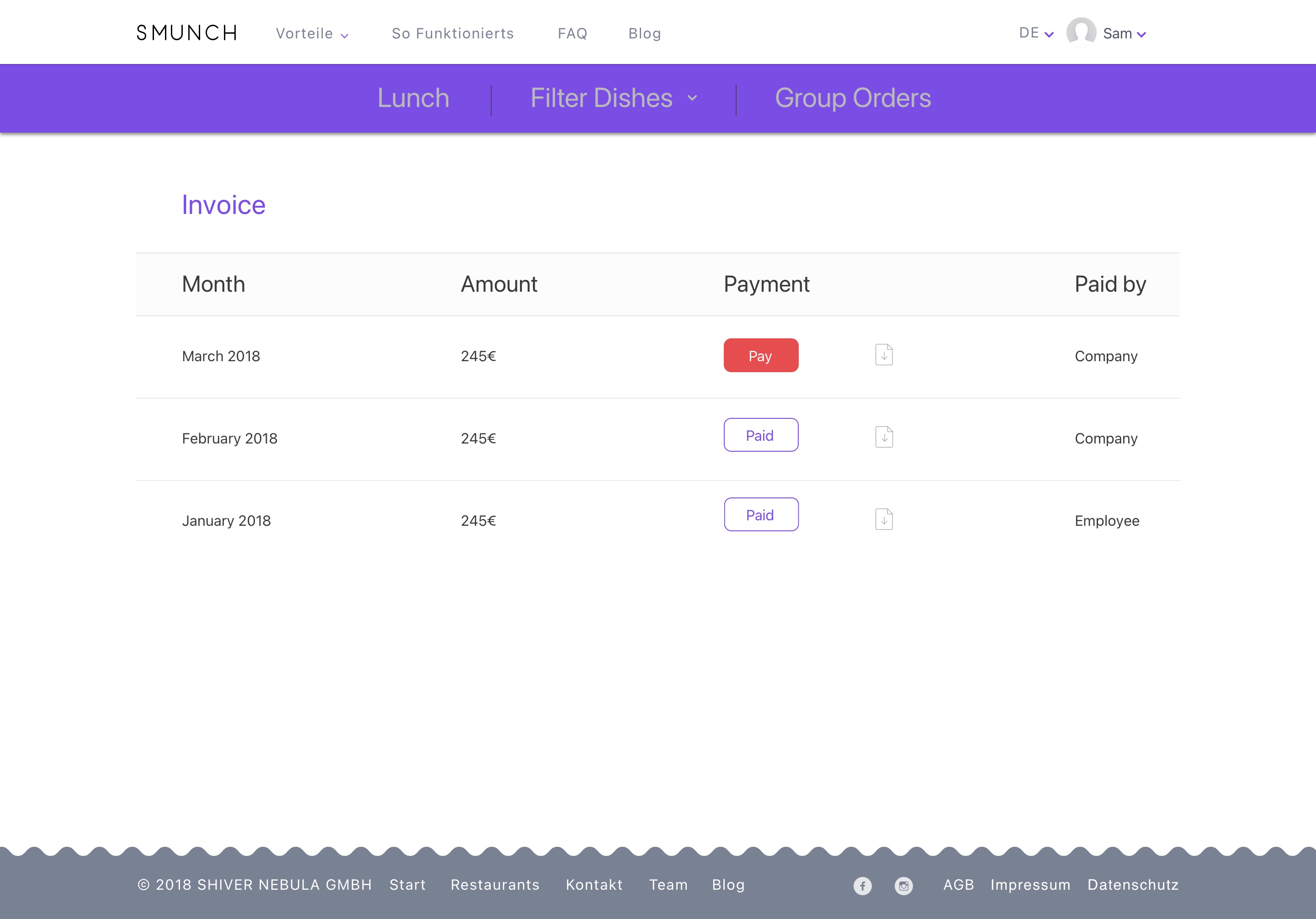
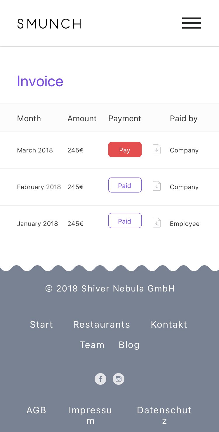
Invoice
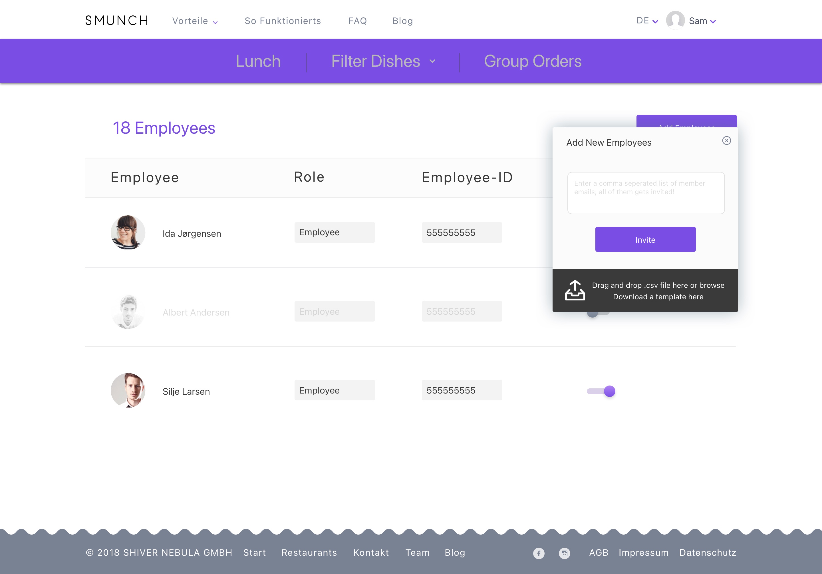
Add New Employees
Mobile App
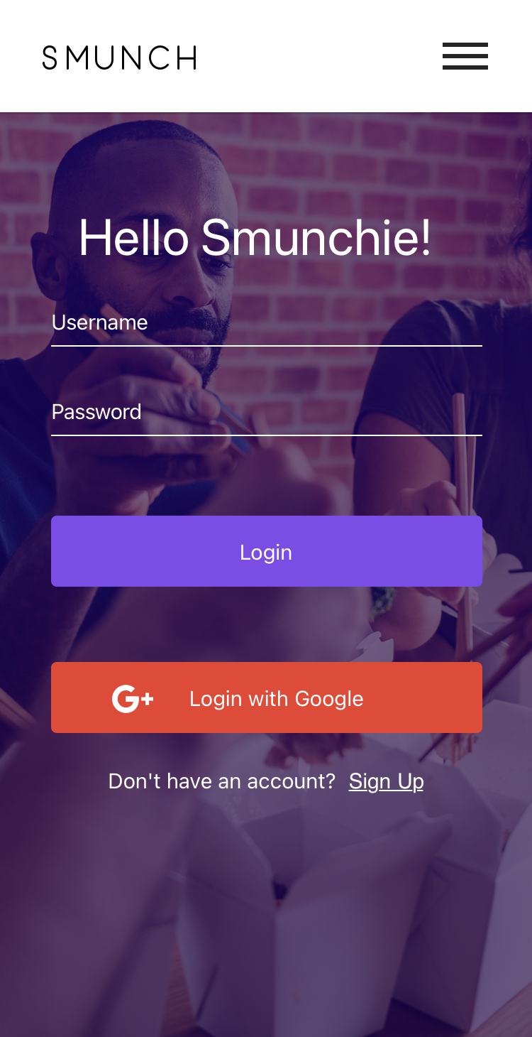
Login
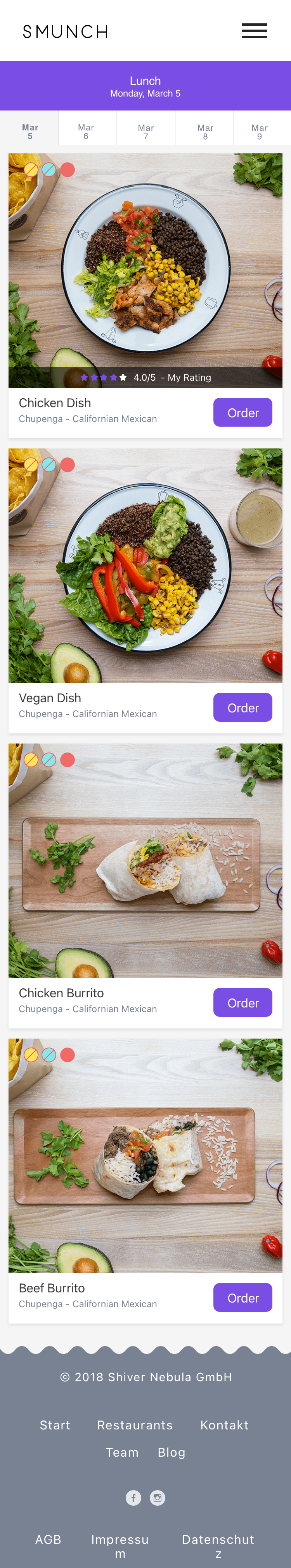
Lunch Orders
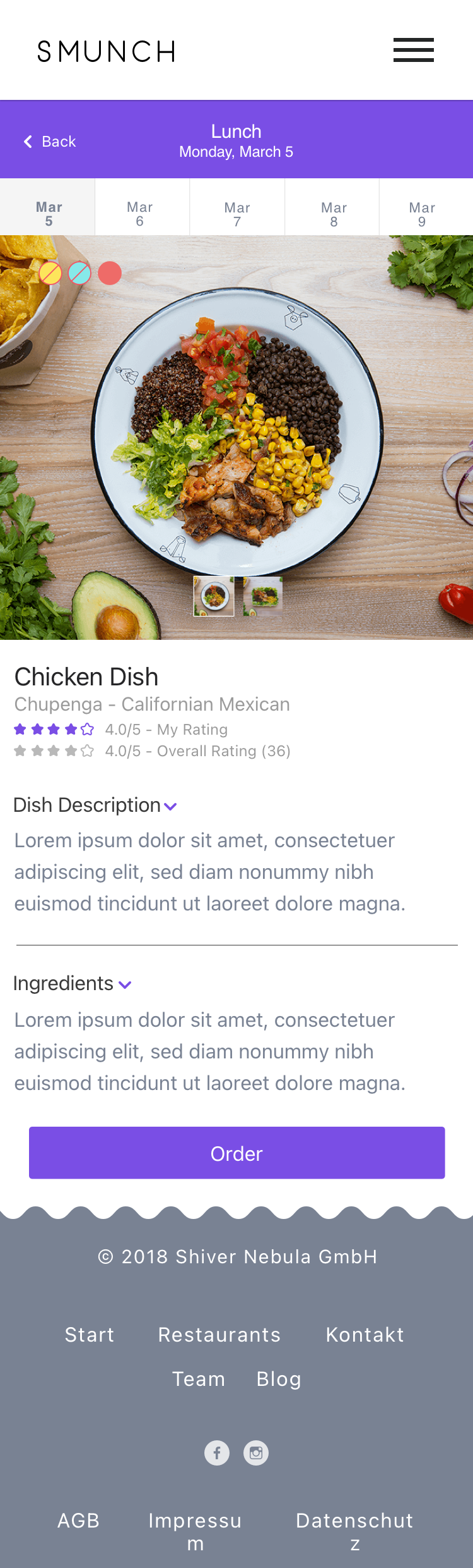
Lunch Detail
Ordered Dish
Lunch Orders
Group Orders
Review Orders
Success Order
Update Order
Employees
Invoice
Settings
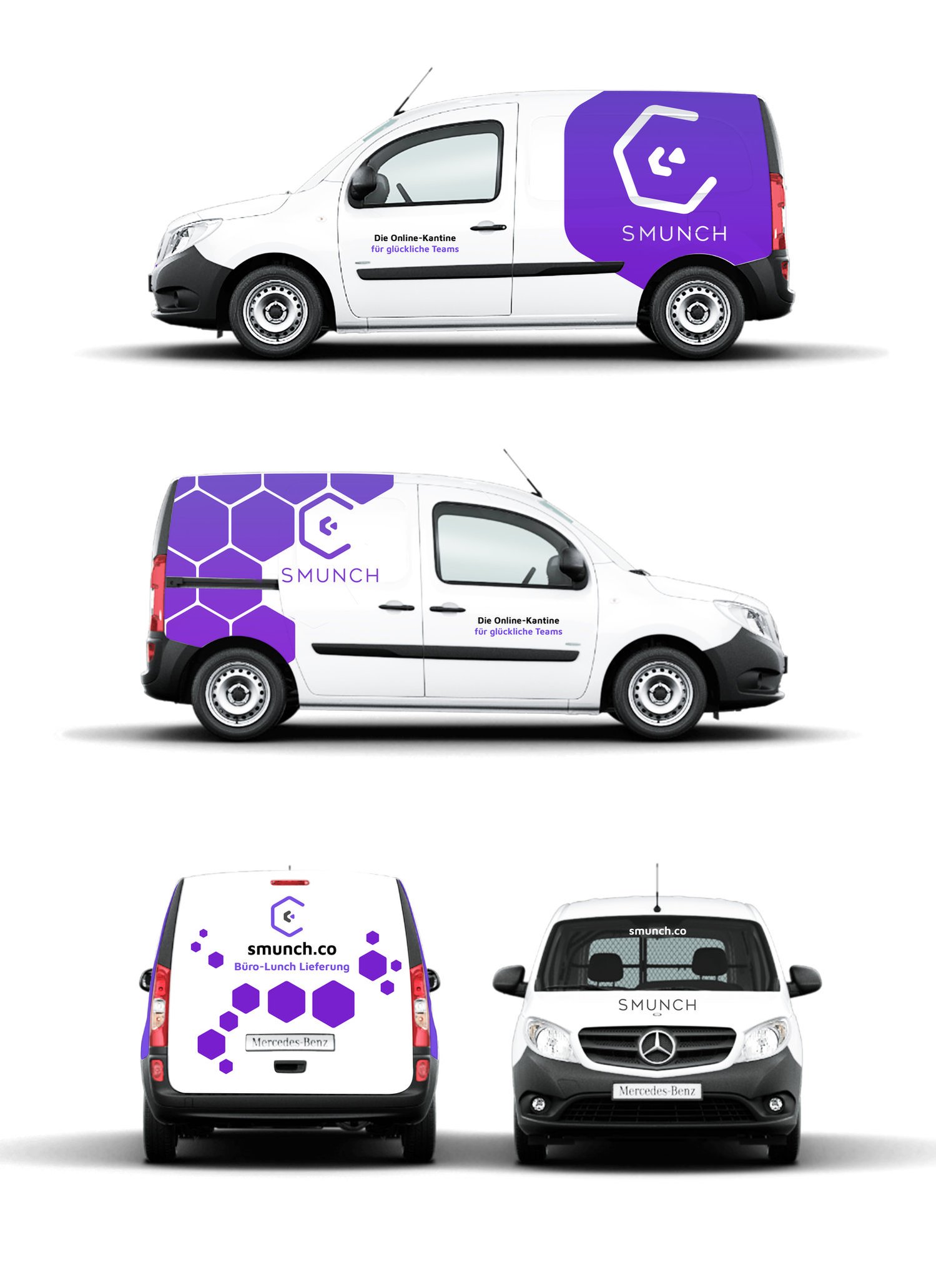
Van Signage Design
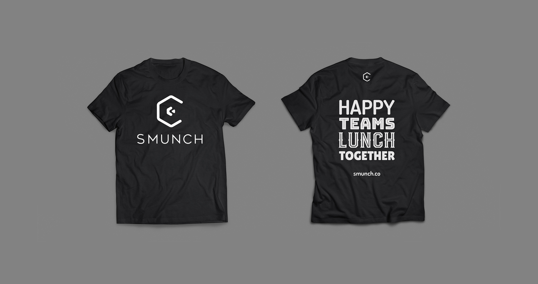
T-Shirt Design
Roderick demonstrated strong commitment, delivering high-quality designs for print, promotional materials, and the company website. His work consistently met our expectations, showing both independence and creativity.